The design of an office space has not often been closely related to the needs of that space. For example the main focus of a company building can often be seen only in the reception area and the façade, there only to enhance the corporate image, and to 'look good'. Also the space is designed purely to maximise the amount of work available, cramming in as many people as possible. Thirdly the space is often restricted by planning permission, usually resulting in high rise sky scraper buildings, restricted by their box shapes and plain façades.
This is the Larking administration building, the photo taken in 1907. As you can see from this although the design industry is almost trying to convince the public that office design has taken such a huge leap forward, it can be proved that the design principles still remain the same. Office spaces were then, and still are used to maximum efficiency with uninteresting layouts and warehouse imitation like designs. The core ideas remain the same, it is just the technology and the materials used that has evolved, giving us a sense of moving on.
Although our work ethic has changed over the years, now including working within a team, using the space as a group, different timings and work patterns, and home from home etc, this has not changed how we design our work spaces.
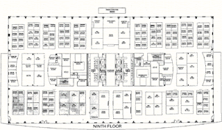
The picture to the left is the floor plan of the Larkin building, from 1904, and below a modern office space floor plan from 1990. As you can see when the photographs are taken away and only the simple layout is shown, the similarities are great.

It seems to me that the next step is to investigate the modern ways in which our workers now carry out their practices, and design a space that tailors to each one of these needs.
Worthington, J (1997). Reinventing the Workplace. 2nd ed. London: Architectural Press.


No comments:
Post a Comment